To track KPIs in Excel, start by structuring your data properly with clear headers and consistent formatting. Utilize pivot tables and charts to summarize and visualize your data effectively.
Add interactivity through slicers and timelines for easy filtering. Design an intuitive dashboard that focuses on critical metrics and provides context.
Consider various data input methods, including cloud-based solutions for real-time updates. Leverage Excel features like formulas, data validation, and Power Query for complex analysis
Automate data refresh to maintain up-to-date information. For more advanced capabilities, you might want to explore Power BI.
The following sections will provide a deeper exploration into these strategies.
Use a proper spreadsheet structure to track KPI
A well-structured spreadsheet is the foundation of effective KPI tracking in Excel.
When designing your KPI dashboard in Excel, you’ll want to organize your data meticulously for paramount data management.
Start by arranging your information in complete rows and columns, ensuring each row represents a single data entry and each column a specific metric.
It’s indispensable to create meaningful headers that accurately describe the data beneath them, avoiding confusing abbreviations.
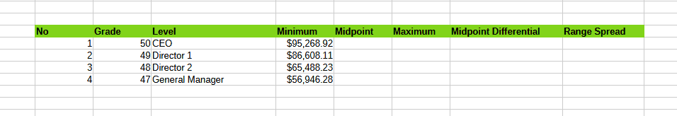
This approach is similar to how traditional pay grades define salary ranges for job positions, providing a clear framework for organizing information.
By structuring your spreadsheet in this way, you’ll create a transparent system for tracking and analyzing your KPIs.
Convert your data range into an Excel table, which will automatically expand as you add new information, maintaining formulas and formatting. This feature simplifies sorting, filtering, and analyzing your KPIs.
Separate your raw data from analysis sheets to maintain data integrity and facilitate updates. Consistency is key: use uniform date formats, appropriate number formatting, and text for categorical data.
Avoid leaving blank rows or columns within your dataset; instead, use placeholders for missing data.
Finally, utilize named ranges or table names in your formulas for improved readability and maintenance. By adhering to these principles, you’ll create a robust spreadsheet structure that enhances your ability to track and visualize KPIs effectively.
Utilize pivot tables and charts
Pivot tables and charts are powerful tools for tracking KPIs in Excel, allowing you to summarize and visualize large datasets quickly.
To create a pivot table, select your data range and navigate to Insert > PivotTable. Then, drag and drop fields into the appropriate areas: rows for categories, columns for time periods, values for metrics, and filters for additional analysis.
This structure enables you to dynamically analyze your KPIs from various angles. Measuring business impact is indispensable when using pivot tables, as it allows you to track financial metrics, operational efficiency, and customer-related data in one extensive view.
For data visualization, transform your pivot table into a pivot chart by selecting Insert > PivotChart.
Choose a chart type that best represents your data, such as column or line charts for trend analysis. Customize your chart using the PivotChart Analyze and Design tabs to enhance its visual appeal and clarity.
To maximize the effectiveness of your KPI dashboard in Excel:
- Keep your source data well-structured and up-to-date
- Use meaningful names for pivot table fields
- Create multiple pivot tables and charts to analyze different aspects of your KPIs
Add interactivity
Four key methods can enhance the interactivity of your Excel KPI dashboard.
First, implement slicers and timelines to provide intuitive filtering capabilities.
Slicers allow users to filter data across multiple visualizations simultaneously, while timelines offer specialized filtering for date fields.
Second, create dropdown menus to enable users to select different views or metrics, leveraging VLOOKUP or INDEX/MATCH functions to display corresponding data.
Third, utilize conditional formatting to dynamically highlight important data points, making it easier for users to identify trends and outliers.
These interactive features can profoundly improve data integrity and accuracy in your KPI tracking, similar to the benefits provided by compensation management software. Finally, develop dynamic charts that respond to user input, using named ranges and OFFSET functions to create flexible data ranges.
Importance of building KPI dashboards in Excel
Designing an effective dashboard boils down to presenting your KPIs in a clear, intuitive, and actionable format.
When creating your KPI dashboards, focus on the most critical metrics and KPIs that align with your business objectives.
Limit the number to avoid information overload, typically including 5-9 key metrics.
Choose appropriate visualizations that best represent your data, such as bar charts for comparisons or line graphs for trends over time.
Real-time dashboards can help visualize performance trends and areas for improvement, enabling prompt responses to performance issues. Regular feedback and monitoring of these dashboards can increase employee engagement and productivity.
To create a powerful dashboard template, consider these essential elements:
- Organize information logically, grouping related metrics together and using a layout that guides the eye naturally.
- Implement consistent formatting with a cohesive color scheme and maintain uniform fonts and sizes throughout.
- Provide context by including target values or benchmarks for each KPI, using color-coding or icons to indicate performance status.
Remember to tailor your dashboard to the specific needs and knowledge level of your stakeholders. Enable interactivity by allowing users to filter data or drill down for more details. Continuously gather feedback and iterate on your design to guarantee your dashboard remains relevant and useful for data-driven decision-making.
Consider data input methods
In light of efficient KPI tracking, choosing the right data input methods is essential.
Excel offers various approaches to streamline your data entry process, guaranteeing accuracy and collaboration.
Consider creating structured tables within your Excel worksheet, implementing data validation techniques, and utilizing conditional formatting to highlight pivotal data points.
For real-time collaboration, storing your Excel files on cloud platforms like OneDrive or SharePoint allows multiple users to edit simultaneously, reducing version control issues.
Microsoft Forms and PowerApps provide custom solutions for data collection, automatically populating Excel spreadsheets with responses.
SharePoint lists serve as lightweight databases, easily exportable to Excel for analysis.
Power Query enables data import from diverse sources, while Power Automate can trigger automatic updates based on specific events.
For advanced users, API connections offer direct data pulls into Excel. Consider a hybrid approach, combining methods that best suit your team’s skills and data sources.
By carefully selecting and implementing these data input methods, you’ll streamline your KPI tracking process, minimize manual errors, and ensure your Excel dashboard consistently reflects the most up-to-date information for data-driven decision-making.
Leverage Excel features
With your data input methods optimized, it’s time to harness Excel’s powerful features for effective KPI tracking.
Excel offers a wealth of tools to transform raw data into meaningful insights.
Formulas and functions like SUMIF, COUNTIF, and AVERAGEIF allow you to perform conditional calculations, while pivot tables enable quick summarization of large datasets and creation of dynamic reports.
Conditional formatting helps visualize performance ranges and highlight KPIs that deviate from targets.
To maximize your KPI tracking capabilities:
- Utilize charts and graphs to represent data visually, choosing appropriate types for different KPIs (e.g., line charts for trends, bar charts for comparisons).
- Implement data validation to guarantee consistent and accurate data entry through dropdown lists and input restrictions.
- Leverage Power Query and Power Pivot for handling complex data relationships and large datasets beyond Excel’s standard limits.
Automate and refresh
Once you’ve set up your KPI tracking system in Excel, it’s time to streamline the process through automation.
Power Query offers robust features for automated data refresh, allowing you to establish queries that update at specified intervals without manual involvement.
You’ll find these options under the Data tab, in the Queries & Connections pane. Right-click on a query, select Properties, and you can configure refresh intervals and enable background refresh.
To enhance your KPI tracking, consider implementing these Power Query features:
| Feature | Benefit | Implementation |
|---|---|---|
| Automated Refresh | Saves time, maintains up-to-date data | Set refresh intervals in Query Properties |
| Data Transformation | Standardizes data processing | Create reusable transformation steps |
| Multi-Source Integration | Consolidates KPIs from various sources | Use Power Query to merge data from different files |
Power Query’s data transformation capabilities allow you to apply consistent changes to your KPI data automatically.
You can split columns, filter unnecessary information, or combine data sources.
These transformations are reapplied each time you refresh, maintaining your KPIs’ accurate processing.
By leveraging these automation features, you’ll considerably reduce manual effort in your KPI tracking process, allowing for more frequent updates and more time for analysis.
Consider Power BI
Power BI’s robust capabilities take KPI tracking to the next level, offering advanced features that Excel can’t match.
With its powerful data processing abilities, Power BI handles millions of rows effortlessly, enabling you to analyze vast datasets without performance issues.
The platform’s superior data visualization tools create interactive, dynamic dashboards that allow for real-time exploration and drill-downs, providing deeper insights than traditional Excel charts.
As a cloud-based solution, Power BI offers several advantages:
- Accessibility from anywhere, enhancing collaboration across your organization
- Automatic updating of dashboards, ensuring up-to-date KPI tracking
- Integration of advanced analytics and AI capabilities for predictive modeling and anomaly detection
You’ll benefit from Power BI’s enhanced customization options, allowing you to tailor dashboards to your specific KPI tracking needs.
The platform’s advanced analytics features, including natural language Q&A and automatic insights, help you uncover hidden patterns and trends in your data.
While Excel remains a valuable tool for many tasks, considering Power BI for your KPI tracking can greatly improve your data analysis capabilities, enabling more informed, data-driven decision-making across your organization.
Conclusion
By implementing these strategies, you’ll transform your Excel spreadsheets into powerful KPI tracking tools.
You’ve learned to structure data effectively, leverage pivot tables and charts, add interactivity, and design impactful dashboards.
You’ve also explored efficient data input methods, automated processes, and considered Power BI integration.
Remember, the key to successful KPI tracking lies in utilizing Excel’s full potential while maintaining clarity and accessibility. With these skills, you’re well-equipped to make data-driven decisions and drive your organization’s success.